

Anyway, here is some mucking around with type. I used Nouvelle Vague at first before trying some others and returning to Nouvelle Vague because the shapes of some of the thicker stems are realy curved and almost sensual, which I feel really suits fashion.
And it's part of the high-fashion visual language, or at least I feel it is, referring back to THIS context post.
Open publication - Free publishing
The problem I face with Nouvelle vague is that it doesn't have an ampersand in the font, so I used Bodoni, because it's a loose fit, and then modified it like so:

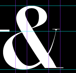
Then I made sure the ampersand height was the same as the header line so there's a nice symmetry and volume created

No comments:
Post a Comment